
How We Helped Beanstalk Genetics Turn Complex Cannabis Genetics Into Simple, Visual Information
We started working with Beanstalk Genetics in 2026.
Beanstalk is a new seed company, but the people behind it are anything but new to cannabis genetics. They had spent years working on their own strains, testing, selecting and refining their genetics.
Then, before their appearance at Spannabis in 2026, Nico sent us a message:
“We finally have some genetics worth selling.”
Knowing Nico for decades, I knew he meant it.
He is a serious genetics geek. And that is exactly what you want from someone creating cannabis genetics. He cares about the details, and selling something that isn’t good enough simply isn’t his style.
So Beanstalk had the important parts covered.
They had the genetics.
They had the brand.
They had the artwork.
But they were missing something.
They needed a way to explain their genetics quickly and clearly.
They needed a brochure and product menu that would help people understand what Beanstalk was all about.
Starting With Research
At We Know Hydro, we start every project with research.
This was our first project in the cannabis seed genetics market, so we wanted to understand how the established seed companies were presenting their products.
We looked at seed banks, breeders and other companies across the industry.
And this was where we started to see an opportunity.
The information was there, but we felt there was a better way to present it.
We wanted Beanstalk to look like an established player in the market, even though they were a new name.
But there was another challenge.
Cannabis genetics can be complicated.
There can be a huge amount of information behind every strain. Genetics, flavour, characteristics, growing information and expected yield can all be important.
Our job was to make that information much easier to understand.
Looking Outside The Cannabis Industry
Rather than only looking at other seed companies, we started looking at completely different industries.
We asked ourselves:
“Which consumer products have to explain a lot of information quickly?”
One of our first sources of inspiration was something most people in the UK see every time they go shopping.
Food packaging.
More specifically, the traffic light labelling system used on food products.
It was a great starting point. It showed us how simple visual information can communicate something quickly.
But we didn’t think it went far enough for Beanstalk.
We needed something that could communicate flavour profiles as well as other important information.
And we wanted the system to work internationally.
Cannabis shows attract people from all over the world. Not everyone visiting a stand will speak English, so we wanted someone to be able to look at the brochure and understand the basics without having to read a page of text.
That meant using graphics instead of words wherever possible.
Turning Flavour Into Icons
Our main focus was making two things easy to understand at a glance:
Flavour profile
Yield
For flavour, we created a collection of simple icons.
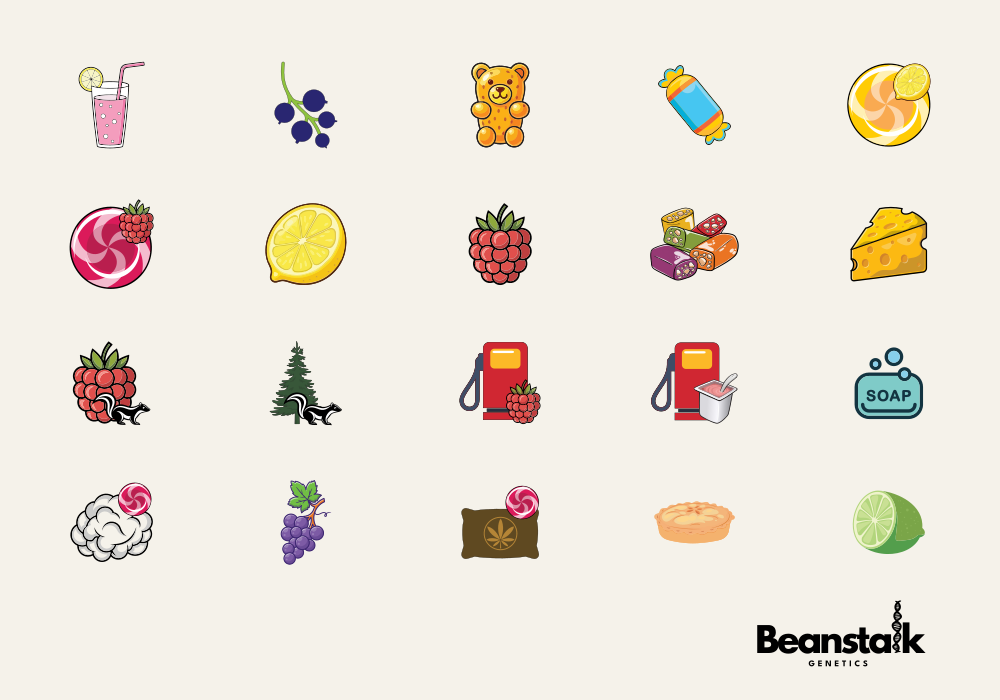
Each flavour icon was designed to represent the profile visually.
Some were very simple.
For example, Cheese could be represented by a simple piece of Swiss cheese.
Others were more complicated.
- For Sweet Berry, we could combine a sweet (candy) and a raspberry.
- For Berry Funk, we used a berry alongside a skunk.
- And for Dirty Berry, we combined a berry with a diesel pump.
The idea was simple.
Instead of reading:
Sweet, fruity, berry notes with a funky character…
You could simply look at the icons and get the idea.
The icons also allowed us to combine two flavour characteristics into a single visual system, giving each genetic strain its own quick visual identity.
Making Yield Easy To Understand
We took a similar approach with yield.
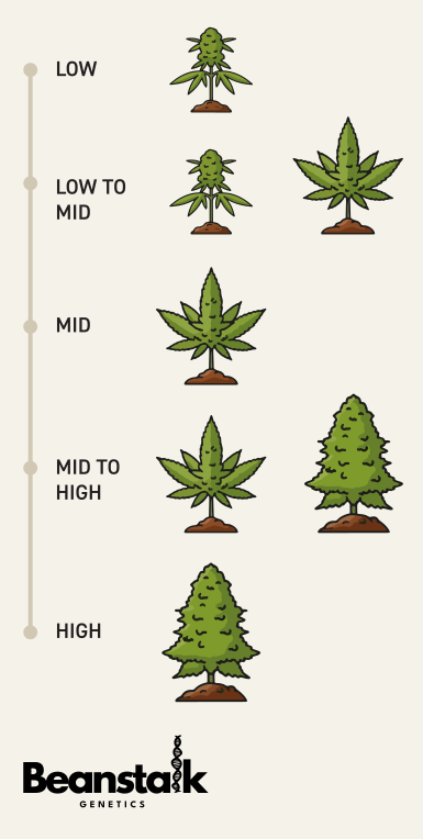
Rather than using complicated numbers or long descriptions, we created a five-stage visual scale:
- Low
- Low to Mid
- Mid
- Mid to High
- High
Each stage was represented by a physical increase in plant size.
This was important because we wanted the system to be easy to understand even if English wasn’t your first language.
Someone could look at the scale and immediately understand that a larger plant represented a higher expected yield.
Simple. Visual. International.
Making Beanstalk Look Established
The final goal wasn’t simply to make a nice brochure.
It was to create something that made sense for Beanstalk Genetics as a business.
They were a new company entering a busy market, but the work behind their genetics had been going on for years.
We wanted their marketing materials to reflect that.
The result was a product menu and brochure designed to make the information quick to understand, easy to compare and hard to ignore.
It takes a complicated subject and breaks it down into simple visual information.
And, importantly, it gives Beanstalk a system they can continue to build on as their range grows.
A Great First Project
We were really pleased to start our work with Beanstalk Genetics on this project.
It gave us the chance to take what we know about branding, design, information and consumer marketing and apply it to a completely new area.
More importantly, it showed us that good design isn’t always about adding more information.
Sometimes it’s about finding a better way to show the information you already have.
As Beanstalk continues to grow its genetics and its range, we’re looking forward to helping them build the brand further.
If you’re a cannabis seed company, breeder or genetics brand looking for better brochures, product menus, catalogues or marketing materials, we’d love to hear from you.
At We Know Hydro, we don’t just make things look good.
We make complicated information easier to understand.